

Raise your hand if you've ever judged a book by it's cover. (Now put it down; you look silly, and I can't see you anyway. Maybe comment instead?) I imagine you all have judged books by their covers -- we're bookworms, we can't help it! A pretty cover is like a magnet, and a less attractive cover, well, we're probably going to look right over it, unfortunately. Which is why there are reviews and blogs to steer us in the direction of ugly ducklings. But I digress.
In a recent post, I turned book spines into poems, so this week I'll put the front of the books on display.
My ideal cover is simple yet eye-catching, with few, well-matched colors and an easy-to-read font. Speaking of fonts, I'm usually a little turned off when the author's name is larger than the title -- if I'm looking for a particular author, I can usually find it easily because shelves tend to be sorted alphabetically. If I'm perusing with no specific goal in mind, I want to read the titles, not random names that mean little to me (sorry, that's just the truth of the matter). Oh, and it should definitely tell me something about the book.
So, what exactly does this ideal cover look like? I'm glad you asked, because I have a few examples to share!
(links go to my reviews)
1. In the Shadow of the Dragon King by J. Keller Ford

This is the perfect example of my ideal cover. It's simple, has an easy-to-read font, and the title is much more prominent than the author's name. I love the silver accents against the textured blue background and the single image of a dragon taking center stage. I've never actually read this book, but as soon as I saw it on a blog tour, I added it to my Goodreads TBR. It's about teens, a prophecy, a paladin, and a dragon (obviously). Basically, I want to add it to my hoard... er, shelves, asap (what? I'm a bookwyrm after all! and a firm believer in hoarding good books like shiny dragon treasure).
2. Unbowed by Wangari Maathai

The plain, neutral background on this one really lets the simple illustrations and colorful text pop. It's a beautiful cover on an incredible book. In fact, I highly recommend it to everyone, even if you don't like memoirs (I'm not usually a huge fan of them myself). This is a book about an incredible woman who, when she saw a problem, immediately began looking for a solution. And yes, there are trees involved.
3. Insurgent by Veronica Roth

My eye is immediately drawn to the beautiful, intriguing, swirling tree on this cover. In addition, I get a good idea of the setting from the unobtrusive background. This is book two in a trilogy, so if you haven't delved into it yet, definitely start with Divergent. I love, love, love this series.
4. Auralia's Colors by Jeffery Overstreet

I don't typically like people on covers (especially large faces that look nothing like any of the characters...), but I think this one is very tastefully done. The title pops without clashing, and the illustration captures the slightly mysterious feel of the book, while hinting at the main character's playful personality. The plot is hard to describe, other than to say it is a Christian fantasy without being overtly Christian. Although this first book can be a bit challenging due to the author's unique writing style, it's worth the read, and the rest of the series is amazing (at least, what I've read of it!).
5. Dragon Keeper by Robin Hobb

I snatched up this paperback at the bookstore because a) it's about dragons, b) it has a beautiful, simplistic cover, and c) it's the perfect size for holding (yeah, I'm a little weird like that). Yes, it does break my rule that the title should be larger than the author's name, but I'll forgive it that one flaw. Looking closely, you may notice that the dragon perhaps looks sickly and deformed, and that's exactly what the book is about: a herd of deformed dragons. It's an interesting read, and the second book, which I'm partway through, is at least as good as the first!
6. Graceling by Kristin Cashore
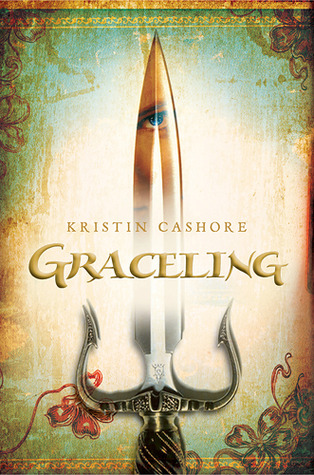
This one is just plain pretty. There is lots of color, but it all fits together pretty well, and it doesn't feel crowded. And yes, if you haven't read it, the eye (reflected in the dagger) is actually significant -- gifted people, called Gracelings, have two different colored eyes. It's a fun YA fantasy, though due to some mature content, I recommend discretion for younger readers. Check out my review for (spoiler-free) details.
7. Eragon by Christopher Paolini
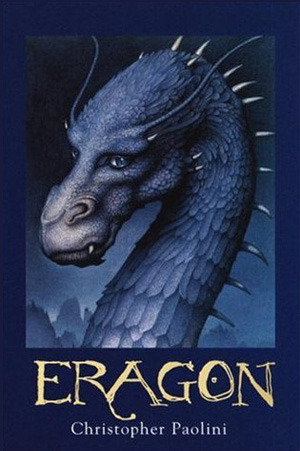
Another dragon book! (gasp.) I love how the simple illustration is framed, with the title and attribution set off at the bottom. It makes for a very neat and organized look while still staying whimsical with the beautiful scratchy font for the title. If you haven't read this one, it's a YA fantasy with a rather cliche plot, but the amazing writing style and characters make up for that. And the sequels flow into a very unique story. I highly recommend it!
8. The Moosewood Cookbook by Mollie Katzen
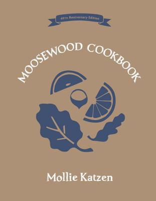
What in the world is a cookbook doing in this list?! Well, I might be less picky about my cookbook covers, but I still appreciate pretty ones (and cringe at the... less pretty ones). I get really tired of seeing someone's plastic smile pasted on the front with their perfect apron and impeccable kitchen. That tells me nothing about the recipes inside. This delightful vegetarian cookbook has a simple cover reflecting simple recipes. What you can't tell from the image is that this edition is hard-bound but with a fabric texture, and the images and text are inset a little, making it especially unique.
9. Because We Are by Ted Oswald

I don't really know what to say about this novel, except that it's gorgeous -- inside and out. The colors pop and blend simultaneously, and the silhouette within a silhouette makes for a unique yet simple image. As intimated by the cover, this is a story about a young Haitian girl, written for an adult audience. It's a rough read, but totally worth it. I very highly recommend this one.
10. Resistance by Jaye L. Knight

The title is the first thing I see when I look at this cover, followed by the sword, which points to the author's name. Very simple, linear, and tasteful, and it can tell us a lot about the book. The woods in the background shows the setting, the sword gives us a general idea of the time period and that some fighting is involved, and the banner across the top tells us that this is a series. Which, actually, is very important, because few things are worse than enjoying a good book only to realize you unwittingly read the second book in a series, because it was not noted anywhere on the cover. In any case, Resistance is an absolutely amazing New Adult Christian fantasy novel, and everyone should read it. That includes you.
*******
What does your ideal cover look like? Did any of the books above catch your eye?
I agree, it's within our nature to judge books by their covers. And I like all of the covers above.
ReplyDeleteI also love love love the Divergent series. And I also hate it when the author's name is bigger than the title or when there's a person on the front that actually looks nothing like the character.
Thoroughly enjoyed this post.
-T.
x
It sounds like we agree on a lot of things! I'm glad you enjoyed the post. :)
DeleteIn the Shadow of the Dragon King and Graceling have SUCH gorgeous covers! Some of my favorite book covers would have to be Inspector of the Dead by David Morrell, Made You Up by Francesca Zappia, and the Hunger Games covers. :)
ReplyDeleteEllie | On the Other Side of Reality
Oh, The Hunger Games do have such pretty covers! I had to look up the other two, but I like them, as well!
DeleteI think it can't be helped you know; by nature we are drawn towards beauty, even if it's only skin deep. My own taste tend to steer towards simplicity, typography, and ... cats... yeah, book covers with cats in them are the bees knees dude! And here's my recommendation for cat covered books: The Master and Margarita, Kafka on the Shore, and... can't think of anything else on top of my head... what the... I'm sure there are many more... *time for some cat-book-cover hunting*
ReplyDeleteThat is so true about beauty! Hmm... you must be drawn to cats as I am to horses. :)
DeleteI love my Divergent copies mainly because they are so pretty. I picked up Graceling and Eragon basically because of the cover.
ReplyDeleteI judge books by the cover all the time. Just this afternoon I was saying to my mother that I wish a copy of a book I had was one of the editions with a cover I like more. I like this post because I'm learning it's okay to pick up a book for the cover. Good covers deserve appreciation :)
That's funny, because I just had a similar conversation with my husband the other day! Mostly because our LotR and Harry Potter sets are a bit mismatched...
DeleteVery interesting post. I have Robin Hobb on TBR. I hope to read paolini's four books maybe in November. :D
ReplyDeleteI'm sensing a dragon theme here... :) I hope you enjoy them!
DeleteThanks for featuring Because We Are here, Serena! :)
ReplyDeleteYou're welcome! It's an incredible book -- I can't believe I haven't read the second one yet!
DeleteNot sure if my other comment went through, trying from my laptop this time.
ReplyDeleteAnyway, I do judge a book by its cover but try to be reasonable about it because I know getting professional book covers done is a privilege some indie authors don't have.
Hmm, nope, I only see one comment. I hate it when that happens!
DeleteAnd yes, it is difficult when looking at indie books -- I rarely reject a book solely based on its cover, because the cover doesn't always reflect what's inside.
Hmm, my favorite covers are ones with beautiful typography or simple illustrations. Once they get too busy I really am not a fan!
ReplyDeleteOh, I agree!
DeleteThanks for stopping by!
My favorite covers are usually the ones with handwriting-like typography. Out of all these, my favorite's got to be Because We Are. So stunning! Great post!
ReplyDelete- Skylar | Skywriting
I guess I didn't really have any in this list, but I do like covers with script font, too! Thanks for stopping by. :)
Delete